Description:
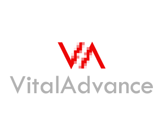
Second approach to the logo for a new "subcompany" of the company where I work (software development for hospitals and that kind of stuff). This "sub" will be in charge of develope systems for heart monitoring.
I'm currently looking for some advise and critics. Thanks!
Status:
Nothing set
Viewed:
1290
Share:


Lets Discuss
I like this one the best of the 3. It (in my opinion) relates best to the hospital aspect. I would like to see the %22advance%22 font color in more of a contrast to the %22vital%22. right now they are to close. **The icon. What about a blue/green grid in the background of the circle, like a heart monitor? JMO
ReplyI agree
ReplyHey, thanks mates. I'll keep it in mind. *Greetings.
ReplyPlease login/signup to make a comment, registration is easy