
Description:
a sastre inspired by the sewer
Status:
Just for fun
Viewed:
1282
Tags:
emblem
•
golden ratio
•
corporate
•
branding
Share:





Lets Discuss
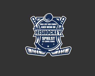
nice. line work can be a bit better, lot's of clutter there at least in this size (those lines behind bother me especially). Typography part is also a bit unreadable... maybe have one simplified version for smaller size usage...
Reply@logoholik thank your, i will definitely follow your advice thank you..:)
ReplyAgree with @logoholik . But your mark is real cool
ReplyPlease login/signup to make a comment, registration is easy