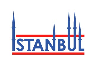
Description:
Logo for a book about Istanbul city.
As seen on:
Blurb
Status:
Nothing set
Viewed:
1848
Share:



Lets Discuss
I think the spikes or whatever they are have been overdone in this logo. I would probably say%0D*-keep the height consistant if you are going to use more than one.%0D*-I would only use 1. 2 maximum, and probably only the first %26 last letters to keep the logo balanced.
ReplyPlease login/signup to make a comment, registration is easy