Description:
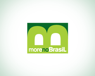
Ok... This is a "re-post". It's a logo for a construction company. The owner's name is Moreno. So we played with that: More no Brasil - It means Live in Brazil. He loved the idea and the concept of using the M and B mixed to look like a "house"...
Status:
Nothing set
Viewed:
1579
Share:



Lets Discuss
I like the idea, but I don't really see a house....
ReplyThanks. In fact is not a house but a %22house%22... living, could be the windows of this house ... using the concept of living... maybe an apartment.... you know what I mean
ReplyI think you mean it's a 'home', not a house in particular. You mentioned that this was similar to the metaphor logo, http://logopond.com/gallery/detail/18781, and I aslo agree that the metaphor one is better, I prefer the symmetry in it and its more pleasing to the eye. But if your client already approved this one then your laughing! Congrats
ReplyThat's right. Thanks. And HOME explain better what I was saying...
ReplyPlease login/signup to make a comment, registration is easy