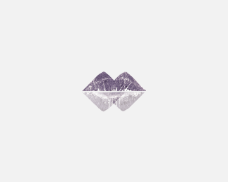
Purple Cairn
by aemindscape • Uploaded: Apr. 07 '12

Float
(Floaters:
8 )
Description:
The Mark was created for a feminine Whisky Brand.
This Mark represents alot of things; purple hills of heather, lips, the highlands and low lands from which the whisky was blended from and 2 blocks of ice.
As seen on:
D&AD Submission
Status:
Student work
Viewed:
2203
Tags:
feminine
•
modern
•
D&AD
•
whisky
Share:

Lets Discuss
Any comments would be much appreciated guys! I'm totaly new to this site! Thanks
Replyhmmm.. the mark is very special and interesting but the typo seems not to work very well with it. maybe use the same color different font and sizing down the whole logo might give it more room to breathe... still a great approach!
ReplyThanks for the feedback t-sovo. The type was used for the intro to the design, this wasn't how it appeared on the label. I will still take your advice and see how it looks with it applied to the introduction.
ReplyI have took your advice t-sovo the logo is now much smaller and the type reflects its colour
Replythis is better but id still try to use a simple sans font and maybe take of the text below and change the background color. the presentation of the brand will be then more clean and appealing. but deff change and simplify the font imo :)
ReplyIll try that thanks also check out the other I uploaded the lips are closer together!
ReplyPlease login/signup to make a comment, registration is easy