robert robinson architects
by adri@n • Uploaded: May. 05 '10

Float
(Floaters:
1 )
Description:
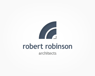
Logo concept for an architectural practice. The two blue arches are intended to be a bold representation of the two r's in the name robert robinson. Any thoughts or suggestions would be greatly appreciated.
Status:
Nothing set
Viewed:
1328
Share:


Lets Discuss
Like the colors, but it looks like communications, wifi, not so architect to me. Whats the concept?
ReplyThanks for you comment vicveco. **I was a bit concerned about the similarity to a wifi type mark. The two blue arches are intended to be a bold representation of the two r's of robert robinson. I was also considering a square version.
ReplyYou need to tie in the style of r in the mark to the typeface to make it more obvious. Does look a little WiFi tho.*
ReplyPlease login/signup to make a comment, registration is easy