Float
(Floaters:
3 )
Description:
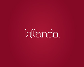
Blanda - interior design
Status:
Unused proposal
Viewed:
1463
Share:

Lets Discuss
Nice work !
ReplyI read b@anda
ReplyThanks for your comment, epsilon. I%B4m not sure yet but maybe i'll reflect the %22Clips%22 to be more similar to %22L%22.
ReplyThe curl on the b is also a little misleading. IMO I would just close the B..like the D.**aapotemkin, I would reflect the paperclip like you said. It would help reinforce the L.
ReplyHow about making the paperclip on the vertical stem of the 'd'...? It would aesthetically match, and not distract or separate letters or confuse as a result. It would complement the shape of the 'd' and still be legible. What about that? That's my suggestion.
ReplyPlease login/signup to make a comment, registration is easy