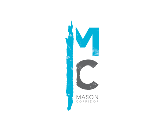
Description:
Along the old train tracks, in my mid sized town, the City is implementing an above ground public transit system. The goal is to help promote quick and environmentally friendly transit along a 5 mile "community space" filled with shops, plazas, ect...
The main concept of my logo is to give a Trendy Urban appeal to this "Metro" system. That way our non-city town can feel like they are up with the best of them. Also, a significant part of the project is to allow access vertically (north/south) across town; which has always been a significant problem. That is why I've focused so much attention on the vertical stroke.
I'm having a difficult time deciding if my nose is too close to this one, and would like what ever input you can give me.
Status:
Student work
Viewed:
1774
Share:
Lets Discuss
grt work :)
ReplyPlease login/signup to make a comment, registration is easy