Description:
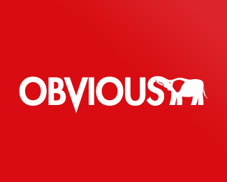
Original logo proposal for a web product development company, requested in red with an elephant mark. This version used the "S" from Obvious as the elephant's trunk.
Status:
Nothing set
Viewed:
1502
Share:



Lets Discuss
Sweeet! I think the V and the elephant are competing for attention, and I'd be more inclined to just use the elephant. Was there a reason you dropped the V past the baseline?
ReplyI completely agree with bpotstra. In fact, I think you could do without the point on the 'V' as well. Just cut it off at the baseline and this would be much stronger. Even so, it's a clever idea and not so 'obvious'. :-D
ReplyYou know what... As much as I do love this, and I really do... I think the elephant's ear could use a bit of work. Instead of reversing out that large shape, could you maybe cut in just the profile of the back of the ear from the red background? Know what I mean? Just a curved outline that comes to a point.
ReplyPlease login/signup to make a comment, registration is easy