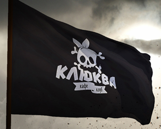
cranberries
by _zair_ • Uploaded: Jul. 04 '12 - Gallerized: Jul. '12


Float
(Floaters:
43 )
Description:
Logo for a brutal club
Status:
Client work
Viewed:
10877
Tags:
a brutal club
•
a skull
•
Cranberries
Share:

Lets Discuss
I love the overall feel and look. My only gripe would be the size of the text in the bottom banner. The logo would have to be smaller in certain situations...eg. napkins, business card, web icon, etc...That said text would then become non legible.
Replylove it! but i first looked at the small thumbnail i thought it is an apple with skull! hehe...but this is very nice!!!
Replyif you take the green leaves off, that would stop it from looking like an apple. course, then you run the risk of it not looking a berry at all. interesting conundrum.
ReplyCool yo!
Replywhat a lovely type, is it a custom made or buyable/downloadable font?
ReplyThank you for rating.
Replylolilol, the font I made myself.
Please login/signup to make a comment, registration is easy