Description:
Client: No Falling Sky
Industry: News Blog
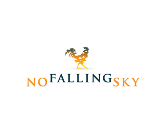
No Falling Sky is slated to be a new website that focuses on the positive side of the news. Instead of the often-negative tone of the mainstream news, this news blog will emphasize what is overlooked. People that are interviewed will be active participants in their community, people who get involved in the issues and make their neighborhoods a better place.
We consulted with the client on the name, which highlights that the world is not ending, as the media might make you think. The final identity revolves around a silhouetted image of a rooster, but not one that’s going around squawking about the sky falling. It’s a stately, serene, thinking rooster that’s taking one step forward. It’s patient, not prone to flying off the handle at the first sign of a rumor. The serif type speaks of distinction and strength, and customized it be thicker, bolder and more legible from a distance by modifying several of the letters. We chose an energetic, fresh orange to contrast with the steady, stable darker blue and used a gradient in the rooster that made his “southern” half lighter to give the mark an uplifting feel. And clouds give it an airy, optimistic feel.
We also created the custom-designed letterhead, envelope and business card for No Falling Sky.
“I just wanted to say thank you for everything. It was a nice experience working with you. You were friendly, informative, and quick at responding.”
– Andrew Illingworth, No Falling Sky founder
As seen on:
www.zookeeper.com
Status:
Client work
Viewed:
389
Tags:
blog
•
news
•
blog
•
news
Share:
Lets Discuss
Please login/signup to make a comment, registration is easy