Description:
Client: 3 River Marine & Tackle
Industry: Sports + Fishing
Right now, things are going great for 3 Rivers Marine & Tackle, a premier fishing supply store located in the Pacific Northwest close to Seattle. The store is bustling. Business is growing. Expansion may be on the horizon. The fish are biting.
We created this new identity to set the course for an even more prosperous future. A professional look that makes customers take notice, puts fear into fish and helps sink the competition. Everyone at 3 Rivers knows and loves fishing – it’s an undeniable passion. If people at the store aren’t working, they’re fishing.
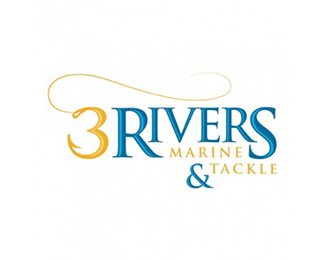
This identity revolves around a smart type treatment, with Rivers anchored to an oversized R and S. Because most people refer to the brand as “3 Rivers,” 3 Rivers is the point of emphasis, with Marine and Tackle positioned strategically in the design. The ‘&’ provides balance to the large ’3′, which features the end of a fishing hook in its lower leg. We then added the fishing line to give the 3/hook more prominence and make it impossible to miss. The visual concept of the 3/hook that can also stand on its own if need be as its own mark.
This energetic golden yellow was selected to bring life and vibrancy to the mark. Its richness reflects 3 Rivers’ status as the leader in the market. The blues chosen bring knowledge, security and stability, while symbolizing all things aquatic and marine. Coupled together, they are the perfect compliment to reflect 3 Rivers’ position as champion fishing experts.
As seen on:
www.zookeeper.com
Status:
Client work
Viewed:
659
Tags:
fishing supply
•
tackle
•
marine
•
fishing
Share:
Lets Discuss
Please login/signup to make a comment, registration is easy