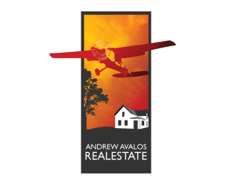
Description:
Logo for a client to show 'taking flight' with his business
As seen on:
Zen Creative Arts
Status:
Unused proposal
Viewed:
2247
Share:


Lets Discuss
This plane going outside of the frame looks familiar? With some kids in the bg having a plane toy.. some production thing or such.. can%60t recall the name..
Reply%5E that does ring a bell. however, in this piece i'm getting a contrast between the nice textured sky and the rigid house. i like it overall.
ReplyQuite right wizemark. Also the Hall Realty logo on their site.
ReplyThis one? http://logopond.com/gallery/detail/45677
ReplyI like the overall style of your logo a lot. However, the plane is a complete disconnect when tied in with real estate. I know that it plays off of your client's %22taking flight%22 tagline, but it still looks/feels kind of random.
ReplyYe, Sean. That%60s the one. I had it in my favs.. :/ Overall shape of these two and that plane in the almost same position telling me that some heavy inspiration%60s involved. I would feel attacked if %60Invision Production%60 was my logo. :)
ReplyRoy, ye.. Hall Realty also looks familiar..
ReplyIt was posted here on Logopond until someone recognised it.
ReplyPlease login/signup to make a comment, registration is easy