Description:
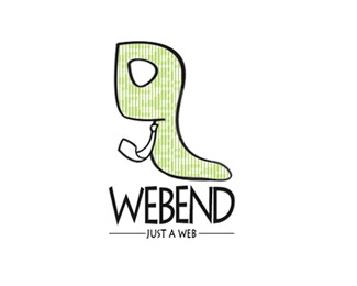
Hello everyone, We are experimenting with new logo and I would like to hear your opinions on this one. Our idea was to create logo, that should represent "clever worm" as a symbol of attentive and skilful work. Thanks.
Status:
Nothing set
Viewed:
1386
Share:

Lets Discuss
i like the visual colors treatment... look original!
ReplyKind of abstract for a worm, but that's what gives it more of a character. The type treatment also lends itself well. Nice job! What font is that btw?
ReplyI like this logo very much :o)
ReplyI'm glad, you like it. *To sandhya: Font is Lithos Pro regular.
ReplyIt is fun indeed but maybe - just a thought - a worm is not the most positive connotation one can give to a web company. Neather would I choose for a virus-logo!
ReplyIn first appearance it looks like the Women Heel Shoes. I can see the worm after that only.%0D*%0D*May be I look too much.%0D*%0D*The color is good. Need to work on the type.%0D*
ReplyThe worm's kinda neat, definitely unique, but I don't really like the type. It could be because it's stretched, it could be because it's kerned too tight. Likely a bit of both, but mostly because it's stretched. Stretched type always looks amateurish to me.
ReplyThanks for your opinions. We'll try to do something with the type.
ReplyPlease login/signup to make a comment, registration is easy