Float
(Floaters:
22 )
Description:
This is a logo for a web designer/developer in FL
Status:
Client work
Viewed:
5404
Share:



Lets Discuss
Ha ha, that's pretty cool.
Reply@ethereal: Thank you :)
ReplyThat is so badass! Gives the impression of %22hire me or die%22 :D.
Replyyep, very cool graphic. and compliments the type very well.
Reply@myob %26 myway999: Thanks for the comment!
ReplyThis is great!
Reply@AlenAdvertising: I'm glad that you saw this! *@I-am-tiago: Thank you :)
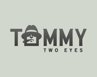
ReplyIt's look good, but I think that space between words %22two eyes%22 is too big. And, it seems that letters in logo need to be discharge, because now the space between last %22M%22 and %22Y%22 looks too big and space between %22M%22s is too small on the contrary.
Replynice
Reply@Alisa1711: so should I give the space to the between %22M%22s? *@cesaralbuquerque dcp: Thank you:)
Reply2Yuka Highbridge, yes, you should. I think that it help to reduce the difference between the letterspaces
ReplyThe middle %22O%22 figure is very foreboding and intimidating. Like I imagine someone name %22Tommy Two Eyes%22 would look. Good work.
Reply@Alisa1711: Thank you so much for your reply. I'll try it*@Jedah Doma: Thank you for the comment :)
ReplyPlease login/signup to make a comment, registration is easy