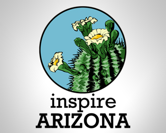
Inspire Arizona
by Yoh • Uploaded: Apr. 15 '13


Float
(Floaters:
2 )
Description:
That's the spirit of Arizona !
Status:
Unused proposal
Viewed:
1579
Tags:
arizona
•
cactus flower
•
illustration
Share:


Lets Discuss
It has a bit of an 80's vibe to it, kinda cool, specially the black and orange one
ReplyThe font choice on the blue ones is best, but you need to even out the kerning. Also pay attention to your spacing in regards to the mark. In the horizontal layout, Inspire should be the same distance from the circle as Arizona. Or keep the two words centered to each other I like the orange to purple in the sky, but don't do that color gradation in the font. Leave it just orange on the black background. Lastly, shrink these down so they have room to breath. The impression of construction does you no favors. My advice is to leave the diameter of the circle as clear space around the logo at all times. If you can't make yourself go that small, use at least the radius of the circle then. I have bad eyesight so I would tell you to go very small as some would here. Check out other logos on the sight to see what I mean. Shrinking your logos down a bit will get you more views, floats and comments. You've got talent kid. :)
ReplyHello !
ReplySorry for my late feedback to your comments, and thanks to have took the time to give me some advices, thanks for the floating too !
Please login/signup to make a comment, registration is easy