Description:
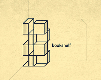
I`ve been making a bookshelf design for my studio today.. quite exhausting process. Admiring now the guys who`re projecting buildings and such. Anyhow, it`ll look something like this.
As seen on:
365logoproject.posterous.com/day-26-bookshelf
Status:
Unused proposal
Viewed:
7133
Share:


Lets Discuss
Looks dangerous! :)
Reply%5ETimber........! %3B) Ha! Very nice per usual my man! Great lines...love the color!
ReplyHaha.. i%60ve just designed it, i%60m not gonna make that thing..that way it would be def dangerous :) Thanks, both! %3B)
ReplyI really like all the designs you created for week %234. All of them really great man. Keep pushing bro!**-felro
ReplyThanks a lot, dude!
ReplyYep, pretty darn cool.
ReplyIs this a logo?
ReplyMay i ask why would you have to ask such a question, Mike? Why would you have to pick the only one from the bunch that might not follow the %60rules%60 completely and ask that? Is it cuz of the gallery? I see your comments only where it isn%60t %60perfect%60, where is, you%60re quiet.. Why%60s that? *Thanks, Sean.
ReplyI only asked Is this a logo? because to me this looks more like a design for a bookshelf? geez Do you think it's a logo? My gosh so sensitive.
ReplyBTW your other comment is totally wrong. I congratulate many I feel are worthy so please don't accuse me of that.
ReplyYes, it is a bookshelf design, but simplified, and no, it%60s not the one of the simplest logos out there. Could it be even called a logo? It%60s up to you, but i%60m not seeing it as a world%60s question number one. Why is it in the gallery? I have no idea. I believe that%60s the reason why you asking, otherwise you would ask the same question much sooner i guess, right? Like before the gallery. And, i%60m not accusing you of anything, i%60m just saying.. you have commented on my work two times only (i think) and both times are on the work when there was some %60mistake%60 and your comments were based around that same %60mistake%60. So, sorry, i should say it better.. i was talking about my work only.
Replyaahh I do love this one Srdjan! Keep going!
Replysorry wizemark, but i think Mike is right. i don't judge it being in the gallery. but considering what your description says, it's not a logo. hope my comment did not bother you.
ReplyThanks a lot, Sneh!*Andrei, dw, i hear you.*David, exactly. That was my initial idea. To have kinda literal and descriptive logo for a custom shelf. I guess i could put complete illo on the page and even more reduced design (like 2 rows only instead of 4 as is now) as a shelf logo over it.*
ReplySean, sorry if I offended you but I was just honest with my question. I was actually asking you, Is this a logo? meaning just that not saying it in a sarcastic way. I also feel that being a designer your going to hear negative critique and better get used to it. If you don't want to hear constructive or negative critique then red flag it. I was basing my question from your description. I guess anything can be called a logo though.
ReplyI think there%B4s no way around that this is not a logo but an illustration. It explains and depicts but it doesn%B4t create a unique and usable identity for a business. From a more technical point of view, the word bookshelf is far too small, the background and details don%B4t belong in a logo.
ReplyMike, ok.*barryconvex, oh, thank you so much for your input. I%60m just starting with logo design, so i%60ll consider your saying for all my next designs. Btw, love your gallery.. can%60t decide which one i like the most. They%60re all quite unique and technically correct. :) Thanks again, man!
ReplyThis is a great mark. It's simple and complex at the same time. Good work!
Replywow nice one..
ReplyPlease login/signup to make a comment, registration is easy