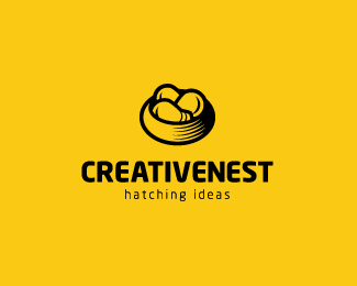
Description:
I`m happy with the mark, but i`m still not sure about the name and tag line.
Updated.
Status:
Unused proposal
Viewed:
15771
Share:





Lets Discuss
I like the name and mark. Maybe creativenesst doesn't need the second 's' at the end. What about a tag line like, hatching ideas or hatching new ideas?
ReplyI was thinking not to have 2nd S in there, but was afraid that it would be read as Creative Nest which isn%60t that interesting..or maybe it wouldn%60t? I like that tag line idea..Thanks.
ReplyI like the mark but truth be told, I am seeing a dog/cat food bowl with lightbulbs in it.
ReplyGreat mark. I'm with Joe on the 2nd 'S' and tagline: 'hatching ideas' works for me.
Replywow nice design :) keep going with this style...
ReplyAlex, i hear you. Thanks, i%60ll look into it.*Chris and Anthony, i think you are both right. I%60ll be updating soon, thanks.*Oliver, thanks a lot. *
Replyas always great execution!
ReplyGreat style and I must say that the colour is very well chosen. Love it.
ReplyThanks, guys! This is updated now per your suggestions.
ReplyAlways liked this, nice one.
ReplyLiking the updates : )
ReplyGreat mark!
ReplyWOW, I'm really feeling jealous over here. Have been playing with birds, nests, eggs and a lot more, wish I would have thought of something like this.**Great mark, congrats.
ReplyThanks a lot, guys!
ReplyCool idea... perhaps a little roughness on the nest would push the icon to stand on its own a bit better? I get it with the wordmark, but I'm not sure I'd get that it's a nest without the name below it. Great style in the rendering, though!
ReplyVery good design. I like the tagline too.
ReplyGreat work. *...365 logo - Great idea.
ReplyAppreciate it, guys!*@Keith, ye i guess that nest could be touched a bit more. Thanks.
ReplySuper cool!
Replylove your work, love yr 365 logo!!!!!!!!!!!!
Reply@Bojan %26 gary Cheers, guys!
ReplyPerfect idea
ReplyWOW!!!! COOL!
ReplyCan%60t get enough of it...
Replyvery clever work ... love the simplicity !
Replygreat idea
ReplyPlease login/signup to make a comment, registration is easy