JTE_2
by Wizemark • Uploaded: May. 19 '10

Float
(Floaters:
15 )
Description:
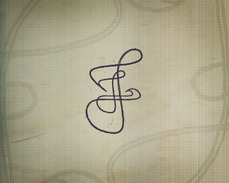
Concept 2. Stylized letter J as a road and an arrow in negative space to portray movement, speed and nature of their business. Concept 1 can be seen here.
As seen on:
www.wizemark.com
Status:
Work in progress
Viewed:
4901
Share:


Lets Discuss
Thanks, Alen! :) I think that i agree re mark-type proportion..will play with it a bit more anyway.. btw, i%60ve uploaded grid base here http://twitpic.com/1p5qnj %5Bif anyone interested%5D.
ReplyJust saw this on FB Srdjan, looks great bud.
Replyvery cool
ReplyI think this version is better because the way in which the arrow is set into the limelight. Also J is here on nice way. At the same time, very simple and memorable logo.
Replytight mark - nice job
ReplyPlease login/signup to make a comment, registration is easy