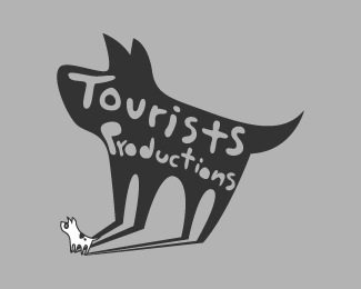
Description:
All designs displayed in my gallery have owners. If you are interested in commissioning me, please contact me to ezaldivar.ilustrador@yahoo.com.mx
+ No limit of design approaches or revisions
+ All Commercial Rights
+ High-quality editable vector files
If you wish to see all my works please visit https://www.deviantart.com/whitefoxdesigns/gallery/
Status:
Client work
Viewed:
10469
Tags:
Wall
•
Shadow
•
Productions
•
Animation
Share:


Lets Discuss
this is rad --- love it !
ReplyYeah... fetching.
ReplyLooks like something you would Dig Nav.
ReplySuper cool!
ReplyLove this
ReplyGonna be the devils advocate here. Reduce this logo.... don;t have the same bite or bark.
Replyummm
ReplyAgree with ALL of the above. Loving it... but the lil dog is already pluggy even at this size. Maybe it's the black outline.
Replyhow can work this in small pixels or mm sizes?
ReplyConceptually, it's wonderful. But I do agree with the others about the scalability issues. I imagine you'd need a few different lockups to work at different sizes...less detail as it gets smaller.
Replyloving this ... pondering on the scalability but still works when scaled down
ReplyCute.
ReplyIt sitll work but not for nothing it works because the Animation Company don't use it in many promo materials and when it show it show on the right material
ReplyPlease login/signup to make a comment, registration is easy