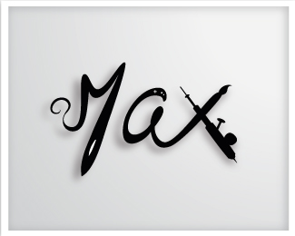
Description:
It's my own trade mark, talks about my tools wich I use for webdesigning, airbrushing, painting, developing, etc...
Status:
Client work
Viewed:
1066
Share:

Lets Discuss
Everyone is a critic, but here are my 2 cents if you would like... I love the logo and flow, I thought the letters could be slightly closer and even more exaggeration on the Thicks/Thins, like in the %22M%22, but a little more thick and carry it over to the %22X%22 as well. Just a thought. Feel free to comment on mine as well.
ReplyPlease login/signup to make a comment, registration is easy