Float
(Floaters:
2 )
Description:
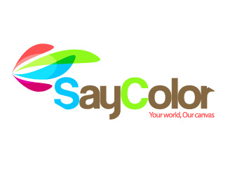
Looking for comments on typeface and use of color.
Status:
Nothing set
Viewed:
1370
Share:
Lets Discuss
Comments are encouraged :)
Replyi think it's a little busy with color. I dont really get the chopped off 'r' and 'S'...or why the S is blue and the C is green. I think you could simplify a lot of things here for a stronger piece. The mark is nice.
ReplyPlease login/signup to make a comment, registration is easy