Orlando Chiropractic
by Voyage • Uploaded: Nov. 17 '14

Float
(Floaters:
1 )
Description:
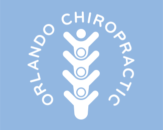
This small practice needed a big change in order to establish its place as Orlando’s Chiropractic clinic. Formerly Orlando Family Chiropractic, we worked closely with Dr. Darren Hollander to develop a brand identity to do precisely that.
STARTING POINT: Changing the name of a successful business is not to be taken lightly. From the start, we both agreed that taking out the word “Family” would do nothing but increase his target audience, and decrease the chances of excluding anyone that the word “Family” doesn’t apply. With this change, the entire brand identity would need to be re-imagined.
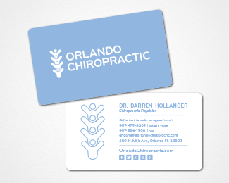
WE DELIVERED: The inspiration for the logo coincided with Dr. Darren’s desire to keep family at the center of his practice without actually saying it. We were able to perfectly blend the spinal column, an image that represents the focus of a chiropractor, with a typical family of four to create an iconic image that accurately reflects the heart of Orlando Chiropractic. To support the new brand we also designed and printed new business cards and collateral. His web presence needed a major makeover. With an abundant supply of videos that have already been created and uploaded to YouTube, Dr. Darren wanted to make his videos the hero of his new website. We were able to accomplish a clean, simple format, which was the end goal.
As seen on:
Voyage
Status:
Client work
Viewed:
1408
Tags:
Brand
•
Logo
•
Chiropractor
•
Orlando
Share:


Lets Discuss
Please login/signup to make a comment, registration is easy