Float
(Floaters:
3 )
Description:
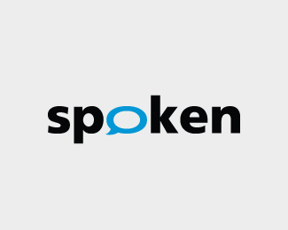
Logo proposed for a lan based chatting software.
Status:
Nothing set
Viewed:
3628
Share:




Lets Discuss
Very nice concept, text bubble should be bolder ... and I think its color palette is too much inspired by quite famous talkmore logo, there is same font and same blue/black color combination.
ReplyI agree the text bubble needs to be bolder. The color palette too I agree is boring but I had not seen the talkmore logo before. Thanks for the comments Janzabransky and I am happy to know that you like the concept.
ReplyI think you should make the triangle part of the bubble point to the right instead.
Replyno, moving the triangle would make it look like a Q. do what Jan recommended and this should be good to go.
ReplyThanks a lot for the comments. I agree moving the triangle to the right would make look like a Q.
ReplyPlease login/signup to make a comment, registration is easy