Float
(Floaters:
2 )
Description:
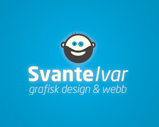
The logo for my own small business, which is graphic design & web.
Status:
Client work
Viewed:
1278
Share:
Lets Discuss
I like the guy, but not sure about his relation to type.
Reply@ woelve: Thanks for your opinion. The guy is supposed to be me %3B-) and %22Svante Ivar%22 is my name.
ReplyYou only have 2 hairs?
ReplyLots of beard, not so much hair.
ReplyI like the fellow too, and I agree the type swallows him up a little. I also think it may be best if you took away the glow effects entirely and removed the blue circles around his eyes. Both are pretty distracting, and this would definitely look better if slightly simplified.
ReplyThanks Chad! I removed the blue eyes, the glow and also to two strokes for hair. It turned up much better!
ReplyCool dude as an icon! Have you considered using a regular (not italic) type? I think a regular type will communicate better with the icon.
Reply@ tass. I haven%B4t but I will try and see how the logo turns out. Appreciate your kind comments.
ReplyReminds me of the %22Life is Good%22 characters. Not sure how I like the beard, but everything else is great!!
ReplyPlease login/signup to make a comment, registration is easy