Float
(Floaters:
3 )
Description:
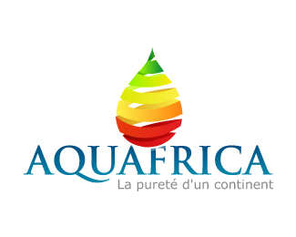
The colors used are the three Pan-African colours: green, gold, and red.
Status:
Nothing set
Viewed:
2232
Share:



Lets Discuss
Too many colors, in my opinion. Is it always going to be printed full-color? I think this logo relies far too much on full color, and because of it does not really have a unique and distinct overall shape. How would it work in pure black and white... no grey? I find that's a good test to see if a logo has an easily recognizable unique shape and structure.*
ReplyWith the colors in the water drop it looked like a pear at first to me - I'd consider simplifying the colors in the mark and maybe look at getting the color into the logo type.
ReplyWhat a mark man!
ReplyI think it's great that you didn't go down the familiar route of using the shape of the continent.
ReplyPlease login/signup to make a comment, registration is easy