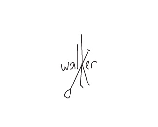
Description:
A different direction i'm playing with. the "K" mimicking the relaxed front facing standing posture with paddle.
Status:
Nothing set
Viewed:
3156
Share:


Lets Discuss
paddle really liked:)
Replyreally nice work ...
ReplyAnd let the refined aesthetes'm not interested.*In terms of identification and recognition - is a perfect job
Replythanks sergey and bernd. just quickly sergey, perhaps it's a translation thing and apologies for not understanding, but i'm not sure what you meant by %22And let the refined aesthetes'm not interested%22
ReplyI took that to mean that he doesn't mind that it's not perfectly refined (it looks hand drawn). I could be wrong.
ReplyAbstract and funky, Matt, I like it. I've always admired your aspiration to be diverse in style and exploratory in finding solutions. Cheers.
ReplyThank you sean, i am seriously honoured by your comments - i'm a big fan of your work also, so it means a lot. thank you.
ReplyI liked it all at once:)
Replylegend! thanks sergey
ReplyGuys, why are so wonderful sign is not in the gallery?*David, do need to be guided only by their own feelings?
Replyhttp://www.sky.fm/play/tophits
Replyit's Great minimalistic design
ReplyBernd, you also write a few words about Walker SUP's TVO*David I already scared ....
ReplyI also say a few words.*In order to understand something - you need to do it, or feel it.*Just so ignore - it is not good .... it's not true
ReplyIf I create a company of extreme hunting or fishing - I bought this sign!
ReplyAuthor, hold it for me:)
ReplySergey, thank you so much for the positive comments you've dished up for this logo. i'm really honoured as i'm a huge fan of your work. everything is on hold for this project for now. if things don't go forward it's all yours... :)
ReplyI hereby nominate sbdesign for Commenter Of The Year%AE**
ReplyI support his candidacy:)
Replyraja said on Nov. 13 '11**I hereby nominate sbdesign for Commenter Of The Year%AE**%3C3*
Reply%5Eha! this has been an interesting thread.
Replyhaha, what Nikita said. :) Looks good, Matt, but i prefer the other one (hat). Which one got selected in the end anyway?
Replythanks mate, i jumped the gun with this project and it may not go ahead now. i never presented the concepts to the client. there was lots of work that would of gone in to the presenting of concept 1 so i held off - you know what it's like when you just need to get an idea out. I'm not sure if it's a translation thing but sergey seems sold on this design.
ReplyPlease login/signup to make a comment, registration is easy