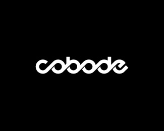
Float
(Floaters:
20 )
Description:
Black and white version. Colour version here
Status:
Nothing set
Viewed:
4812
Share:

Lets Discuss
The b/w looks wicked
Replyjust as glorious in b/w!
Replyyes.
Replyb/w for the win!
ReplyI really like it. Wondering if something different can be done with the 'e', but then again it flows nicely with the rest of the motion of the other characters. Nice
Replythanks all for the floats and comments. i'm really happy with the way the black and white version has turned out. just need to get the colour version spot on now.
Replycheers femili
ReplyIt really reminds me of the logo I purchased for my own branding. (see the avatar)
Replyno inspiration was drawn from this hyperborea. i can see how it reminds you of yours, but it's totally coincidental. this black and white version actually came off the back of the shaded versions i created first. the letters that make up ecobode rendered the design to circular form and flow the moment i heard the name and put pencil to paper.
Replyyup, well I never said that it was inspired by logohype, it is just coincidentially so similar...the world is so small. no acuse, just constatation...
ReplyPlease login/signup to make a comment, registration is easy