Description:
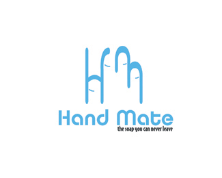
We have a soap project in school. So I created this logo for my project. It consists the letters of "h" and "m". This two letter makes a hand in negative space.
There can be changes in colors.
As seen on:
Brandstack
Status:
Student work
Viewed:
1726
Share:


Lets Discuss
Ummm....sooo....I'm going to go ahead and state the obvious. Hand mate implies that you're in a relationship with your hand (i.e. playing %22whack attack%22) Then you go and use that tagline and wow. Lots of long showers and a hefty water bill. I would consider changing the name at least if you can. Sorry but that's where my mind goes.
Reply%5E Yup that about says it all. I can't imagine this being sold yet..... OH BOY!
ReplyWOW just wow. I mean really for sale? sorry if It sounds negative, but conceptually,aesthetically,brandability,proportionately Do you really think you could sell this?
ReplyMan, their just knocking them out.
ReplyMan, they're just knocking them out.
ReplyYou know what .. this can actually make an excellent prank present.**- Hunny, did you get me anything for the anniversary ?*- Oh, I bought you a brand ! Here it is ... **
ReplyHey I don't intend to be mean, just frustrated with new designers these days. This is exactly why. If one thinks differently speak your mind. It's not a bash it's more of appalled at what is being considered a logo or brand. In fact I'm quite speechless at how many cannot see the difference in good design and good brandablity and conceptual work.
ReplyAnd it's not your fault, I understand it's a %22school%22 project. But it's for sale now and shocked at that not your experience.
ReplyActually it is nothing to do any sexual activity. It's a brand created for a soap, which you can carry with yourself and make you not touch the soaps or soap automates everybody touches. If there is really something wrong about the name I can start to search a new one. But actually if your critics would be beneficial ( saying what is wrong ) I will be glad. And I think there is nothing wrong to try my luck about selling it .
ReplyOK fair enough. I think the name is wrong, well especially now. The concept of the hand forming and H and M is not working so either needs to be ditched or executed differently. Your Tagline is way to small proportionally. Your Hand does not look like a hand at all. Maybe just do a nice hand with nice type and call it like Handy Soap or something.
ReplyOk Logomotive, Thanks for the feedback I will evaluate it
ReplyNot aiming this just at you Uni.Q but some people need to learn the difference between making a logo for fun and attempting to sell a brand identity
ReplyThe circa 1980's type is helping this logo much either...
ReplyLOL @ Firebrand. C'mon man, you can't use recycled jokes, no matter how good they are.
ReplyActually, I take that back. And I would also definitely recommend removing or changing the tagline too. %22The soap you can never leave%22 definitely does not take away from the sexual innuendos.
ReplyPlease login/signup to make a comment, registration is easy