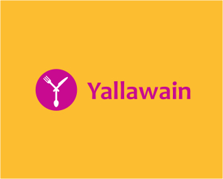
Yallawain
by Type08 • Uploaded: Apr. 12 '10

Float
(Floaters:
14 )
Description:
Logo proposal for a restaurant review and search engine based in Kuwait. Letter Y shaped out of knife, fork and spoon. Also includes an arrow as a direction symbol.
Status:
Unused proposal
Viewed:
3596
Share:


Lets Discuss
Nice color scheme and the concept. However, all elements are looking more like those plastic sets, imo. Perhaps too iconic if you like.. :)
ReplyThanks Srki, glad that you brought that up! The idea behind the concept was 'Restaurant Yellow Pages' so the iconic approach that all the restaurant symbols share was a base for this one.
ReplyGreat concept!!
ReplyThanks Master Alan, glad that you like it! :)
ReplyTIME TO EAT!!! That's what I see and I don't mind if I do! Right after I post and float....
ReplyThanks Craig, glad that you like it!
ReplyPlease login/signup to make a comment, registration is easy