Description:
I got those sharp teeth to bite the road ...'
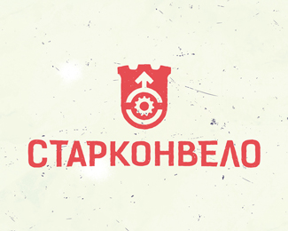
A logo for a local amateur cycling club. Logo text 'СТАРКОНВЕЛО' is 'STARKONVELO', where STARKON is a shortened informal name of the town of Starokostiantyniv (Ukraine) where the club originates, and 'VELO' is obvious :)
Logo is based on the major element of the town coat of arms, the town founder's family coat of arms with arrow and bow, six point star, and crescent moon underneath.
Moon and bow were simplified even more to make logo less graphically heavy. 6 point star was traded for 11 teeth bicycle freewheel. Upper part of the logo bear resemblance with both tower and bicycle helmet front view. Thus cycling theme and the town theme are combined.
As seen on:
dribbble
Status:
Unused proposal
Viewed:
704
Share:





Lets Discuss
Please login/signup to make a comment, registration is easy