Description:
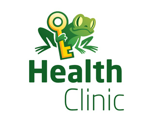
Logo for a Health Clinic with the slogan 'Nøglen til balance' which means 'The key to balance'.
The Frog holding the key was the clients idea!
The project is closed now, but I would like to hear what suggestions you have if I where to take it further? - also see the monocoloured version!
The font used is 'Neo Sans'
Status:
Nothing set
Viewed:
7988
Share:


Lets Discuss
the frog isn't smiling. actually, it looks very non optymistic. But the colours are great!. Maybe try to switch bold type from 'Health' to 'Clinic'. The first one is longer and looks to heavy and dark.
ReplyPlease login/signup to make a comment, registration is easy