Description:
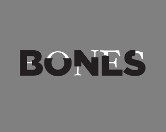
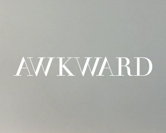
A random/rough typography concept. Bigger image on Flickr - http://flic.kr/p/7BMcGL
Working on more work revolving around this idea (an alphabet being one of them).
Status:
Just for fun
Viewed:
32239
Share:

Lets Discuss
this is very clever! i have a suggestion: what if you make the black letters edges rounded where they meet the white ones. and it would look better smaller and with a nice color background. :D
Replythat would certainly make a unique alphabet, also a very intelligent design concept
Reply@ andreiu: that's a good idea. Would make it look more like flesh and bone. Take it one step further TimKim! Good conceptual thinking here.
ReplyNice... nice...! Great concept... cheers!
ReplyI like this
ReplyThank you for your kind words everyone!
ReplyVery clever concept. Love how simple this is, yet it works so well. Great work! :)
Replyim missing some blood :P very clever!
Replyvery clever :)
ReplySorry, but in my opinion the only letter that works (so far) is the N.
Replyme likes. :) clever concept.
ReplyI can see what barryconvex is saying. The %22N%22 still represents an %22N%22 without the bone-like serif font inside it, but the others might not, except for the %22B%22, but I didn't find the execution of the %22B%22 very interesting. The %22S%22 works, but could've been better... The %22O%22 reads as a %22U%22, t
ReplyClever idea. The mix of serif/san serif works well. There's some room for improvement, but love where this is going.
ReplyNicely done!
ReplyI appreciate the feedback! It is far from done and can't wait to show the final product.
ReplyVery smart and great execution.
ReplyI agree, round the edges, but this is ubber cool.
ReplyThe concept is fantastic. It's one of those you see and think %22damn! I wish i'd thought of that%22 *Well done!
Replyawesome! this is a %22wish I had done%22 king of work!
ReplyLove this. Great work!
Replywhy didn't i think of this ? you make me jealous!
Replyi really can't think like that.......
ReplyClever idea :)
ReplyBrilliant!
ReplyExcelente!!! simple and good concept!!!! :D
ReplyLUUUUUV it! i have a suggestion! how about you use some kind of color scheme or effect that refers to xray vision? maybe some subtle glow and hints of green? just a suggestions. but i truly love it!
Reply@emesghali Yep! I am doing that for the refinement as well as additional pieces in this series. :)
Replygreat idea. this haves some font history meaning. first there were serif classic fonts and than helveticas. %0D*but, since it is for fun, i would suggest red helvetica type (meat) and black background.
ReplyLove this concept. How about a red oval shap at the end of each bold letterform where the bone protrudes from. This would give it some simple dimension to flesh this one out.
ReplyWOW! Really clever concept!
Replyclever pies of work .... gr8 keep it up ..
ReplyPlease login/signup to make a comment, registration is easy