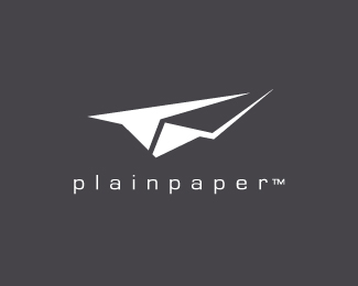
Plain Paper
by Tice • Uploaded: Apr. 23 '10 - Gallerized: Apr. '10

Float
(Floaters:
58 )
Description:
V2: http://logopond.com/gallery/detail/102987
Status:
Just for fun
Viewed:
24599
Share:


Lets Discuss
I like it. Though i'm sure i've seen similar pieces. Good work non-the-less :)
ReplyThanks hypermind!
ReplyLooks good small, I like!
Replyclean and simple
Replyit looks so mature. love it.
Replygud stuff!
ReplyThere's a nice use of negative space here. The way the stroke ends on the right side seems a little harsh and squared off for my taste. That one refinement could have a pretty significant impact.
ReplyThe the use of negative space.
Reply@ Ocularink**Thanks for your useful feedback:*http://logopond.com/gallery/detail/102987
Replyclean perfect...
ReplyClean %26 tidy, but seen it a few times before.
Replythis is schweeeet
ReplyI'd say it's between 7/10 and 9/10.
Reply@ epsilon**thanks man! %3DD***(PS: I like to give people a grade to show them how I feel about the logo on a scale of 1 to 10 %3B-)
ReplyWhat font did you use with this?
ReplyThe power of just two faces. Very nice!
ReplyI second OcularInk. That stroke it dying to come to a point. Nice work.
ReplyPlease login/signup to make a comment, registration is easy