Description:
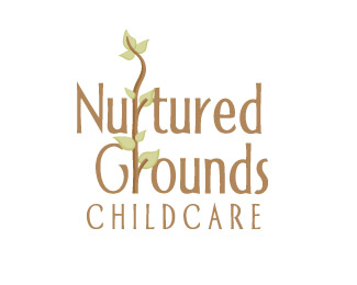
Identity for a start up childcare facility. Taking the approach of a "story book" design.
As seen on:
Status:
Nothing set
Viewed:
2504
Share:


Lets Discuss
Really creative use of the vine idea. Have you thought of changing the brown to a dark green? Kind of like that beanstalk story/cartoon? I'd really like to see %22CHILDCARE%22 half the size and maybe spaced. Right now it's trying to compete with the 2 lines above it.
ReplyHi Micah, thanks for comment. The two r's being connect is meant to represent a tree sapling. I am using a beanstalk to help supplement the brand, both are usually seen somewhat together in most of the items Ive created so far.
Replybtw.. the childcare letters were spaced like that so that the word child helped to emphasize the sapling concept. ex.. growing child.. etc.
Replycan check out http://www.nuturedgrounds.com for the whole concept
ReplyPlease login/signup to make a comment, registration is easy