Float
(Floaters:
38 )
Description:
Floor retailers. Client work.
Status:
Work in progress
Viewed:
4430
Share:






Lets Discuss
very nice type work ... great hand !!
ReplyThank you Mr. Type and Signs!
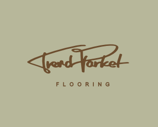
ReplyNice work. The color contrast here is making it a bit hard to see, maybe go a bit brighter and less textured. My eye hesitates at the space between the F of flooring and the script to it's left. My gut says that space should be at least as large as the space between the subtitle letters. Lastly, the O in flooring is interacting with the descender in an awkward way. Maybe a bit more leading is in order? Or also tightening up the tracking on the subtitle and giving it its own defined block separated from the rest.
Replythanks luma for the extensive comment here. did some changes to it. hopefully to your liking :D
ReplyReally nice update!
Replythanks luma, appreciate the words.
Replylikeit!
ReplyPlease login/signup to make a comment, registration is easy