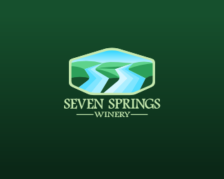
Seven Springs Winery
by TSovo • Uploaded: Nov. 20 '11

Float
(Floaters:
41 )
Description:
So hopefully this will be the final version. I still have the previous one in the showcase. The stream makes a shape 7 which was essential in the logo as well as the hilly landscape. Hope you will enjoy this one better :)
Status:
Work in progress
Viewed:
2161
Share:


Lets Discuss
Ooh, i like this one! it nice and calm and beautiful!* I wish 7 would be more distinct though, but that's me)
ReplyLove the hillscape but is the treatment on the letter S's neccesary.
ReplyConceptually, I really like where you've gone with this. The previous version (the one with 7 literal streams) was on the right track, but I think this one does a much better job of pulling the whole concept together in a cleaner, more direct manner.**Having said that, on a technical execution level, I think this needs just a bit of attention. I'm wrestling just a tad with the perspective, and I'm not quite sure why yet. I know that the stream is supposed to be a part of the landscape, but for some reason, it keeps looking like it's just sort of floating there, and I'm really having a tough time figuring out what's causing me to see it like this. I almost see the 7 and the hills to the left as being on one level, and *below* it, the dark green hill on the right.**Am I just crazy?**You know what it might be? The background hill is at an angle, perhaps if it were more level, it might adjust my perspective a bit.
ReplyOh, and I forgot, I completely agree with Phil's comment about the extraneous treatment of your Ss. I realize that they're doubling as wine glasses, but I think it's too much. Here, you should let the icon do all the work. Stylized type is fine, but it should be done in a manner that compliments the icon, and don't detract from its impact.**On the other hand, if you want to focus on revealing wine glasses in the negative space within your S shapes, then do so in an all-typographic option.
ReplyWell said Jon. Was thinking about this one Tomas and perhaps if you are really adamant about using a stylized wine glass within the name I'd try and alter the letter %22V%22. It'll give you a nice visual line running down the middle of the logo and it will be balanced perfecting in the center. Just a thought.
Replywow thank you a lot for your comments guys i appreciate it quite a lot. i ve already begun working on the hills and the perspective. it felt unfinished but i ll definitely change it towards the right perspective. about the letter treatment i had no idea. the type needs to be able to stand alone and represent the winery without the icon so thats y the glasses but i ll try to follow you guys here. again thank you Jon and Phil. and gabu thanks for the comment i ll update soon :)
Replyupdated
ReplyA good idea course with seven and a landscape!
ReplyThanks Gennady, appreciate you stopped by :)
ReplyPlease login/signup to make a comment, registration is easy