Mosaic Homes
by THEArtistT • Uploaded: Jun. 27 '08

Float
(Floaters:
2 )
Description:
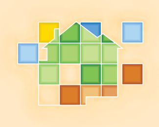
Logo represents a high-end home builder in Arizona. This design is the result of a long but creative afternoon. I did the usual tile/mosaic stuff until I started to incorporate the house outline. Suddenly it just came together. Best logo I have designed to date, in my opinion.
As seen on:
www.mosaichomes.net
Status:
For sale
Viewed:
4,465
Share:


Lets Discuss
Not a huge fan of the type.. or the background color.. but i do like the house/tile mark.. very nice.
ReplyYeah, the background color is not working in this media too well. It is supposed to look like a tile itself. And I needed a color to show the white grout around the tiles. Which, unfortunately, the background is not doing, sigh. Looks better in print on a textured paper. The house has a bit more shape to it if you could see the white. As for the fonts, I mixed two, Book Antiqua Italic and Phyllis Initials. I then went in and tweaked them so they looked like they went together and I took some of the flourishes off of the caps. My intent was to make the text look like bronze and copper embellishments you sometimes used in luxury homes.
Replyredid the background. helps a little.
ReplyI was hoping the mark would eventually evolve to just the mosaic house with the name less and less needed. You know when they become famous. %3B)
ReplyBtw, text was added dead last. I did not have the font library then as I do now (logo was designed in early 2006). There has been talk by the client to change the font, but they don't want to have to pay for reprinting. There is also talk of changing the colors. I'm against that.
ReplyChange the type to a sans serif font, change bg to white and and then center it and then I like this logo! :)
ReplySorry. Approved as is. But thank you for the comment!**I don't think the contemporary treatment would work anyway. Logo is supposed to look old mediterranean and the type to look like it was fabricated out of copper and bronze. A san serif font doesn't illicit either of those two feelings.
ReplyPlease login/signup to make a comment, registration is easy