White Teeth Talking
by THEArtistT • Uploaded: Aug. 19 '20

Description:
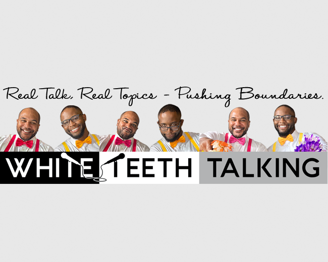
Well... this was a fun one. I was asked to do this logo for two young men starting a YouTube channel. The brief was it had to be black and white. Originally we thought going with the smiles would make it look like a dentist logo. And it kind of does. But in the end the client (and I, surprisingly), warmed to the smiles which are illustrations of the two mens' actual smiles. The logo is largely used without the illustrated smiles. See other variations.
Status:
Client work
Viewed:
852
Tags:
discuss
•
post
•
broadcast
•
vlog
Share:






Lets Discuss
Please login/signup to make a comment, registration is easy