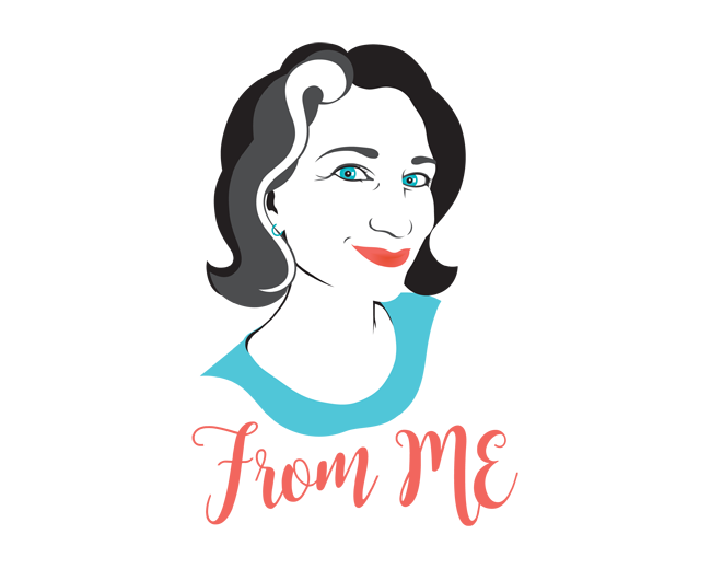
Dinah personal logo
by THEArtistT • Uploaded: Nov. 07 '12



Description:
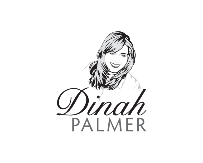
A lot of my client's are realtors, and they all insist on having their image in the logo. More often than not the photos are old, cropped badly and just plain horrid. This time I volunteered to draw the realtor/client instead. I don't know why I did that. Anyway, they love it and now it is off to be printed for the first time. Worried about the color holding up. Common worry. Helps the first printing of it will be in grayscale. :P
Status:
Client work
Viewed:
2,435
Tags:
illustration
•
property
•
remax
•
personal
Share:

Lets Discuss
1 name 2 fonts?
ReplyIf the client doesn\'t want a script or hand lettered type font, than I use all one font. But if the client specifies script, etc. then I break it up because too much script is too much.
ReplyWomen Realtors prefer to have the emphasis on their first names. Makes them appear more approachable and personable. Male Realtors prefer to have the emphasis on their last names. Makes them appear stronger and more business like. There are sometimes exceptions, but that is the general rule. The Realtor logos, and Insurance Agent logos, I do are what are now coined \"Personality\" logos. The Realtor\'s or Agent\'s personality is what is being portrayed. It\'s a niche market I fell into and is working out for me. Unfortunately I don\'t always get a Lyon Insurance Agency logo out of it, but it pays the bills. Ask some of the old fogies about the \"Renita\" logo. That one is still going strong!
ReplyI really like the idea Trish! Because even if the realtors had studio quality photos, they are lost amongst the myriad of other photo-call-cards. But what I would like to suggest is maybe instead of the portrait illustration being in full color and detail, why not just do a monochrome silhouette style. That would also compliment the nice type you chose. Then, if the client can afford letterpress cards....
ReplyThanks! I just did that for the main guy at the realty office, so I can\'t do it with her brand, unfortunately. She works out of his office. I\'ve done 12 individual logos and other advertising for realtors out of his office in five years. Not going to pee in that honey pot. I was not initially intending on doing full color and will make sure it works in black & white (probably gray and white), regardless. Only the main guy and a few others can afford high quality anything, and Dinah is just starting out. She entertained me doing illustrations of everyone on her team, but couldn\'t afford it in the end.
ReplyThanks for the floats!
Replyperfect ...
ReplyThanks Hossein.
ReplyThank you for the recent floats guys and dolls!
ReplyPlease login/signup to make a comment, registration is easy