Phoenix Endeavor
by THEArtistT • Uploaded: May. 13 '11 - Gallerized: Jun. '11

Float
(Floaters:
47 )
Description:
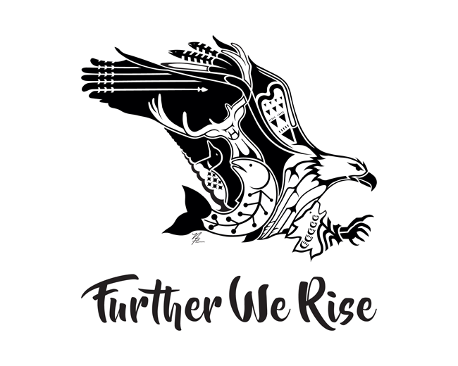
I was commissioned to do a phoenix logo for a gym that trains gymnasts for the Olympics. I studied flame and peacocks to come up with this logo. I positioned the wings up to represent the pose a gymnast makes when they dismount ("stick it"). Unfortunately the client, Elite Endeavor Gymnastics, was already in love with a clip art phoenix they found on shutterstock (image id 35488996) with Elite centered on the chest in a much swirlier font. This was my attempt to steer them in a better direction individually, graphically and legally, but was rejected. They went with the clip art bird anyway. (updated 07/18)
Status:
For sale
Viewed:
8,438
Share:


Lets Discuss
Thanks Wladimir!
ReplyThank you for the floats Josiah and Jerron! Thank you very much. :)
ReplyIt is kind of hardcore for gymnastics, but I still like it.
ReplyThanks for the floats Mike, Matt and Sam! **And Sam, I wanted to incorporate the idea of sticking the landing as well as dance into the phoenix. That part at least was easy. They also train cheerleaders. This phoenix is a lot more feminine and less hardcore than the clip art version they wanted.**I'm glad you like it. :)
ReplyOne of your better pieces Trish.Simplicity is beauty.
ReplyThanks Mike. Really appreciate it.
ReplyWOW! Trish is back!
ReplyThanks Rudy. :) I really like this one. Glad y'all like it, too.
ReplySo glad you're trying to steer the client in the right direction. Don't know how you'd incorporate the name on the chest of the Phoenix. Looking so good. Great colour scheme too.
ReplyThank you Simon (and for the float). This one I was unable to. I put Elite in the fire. I have another phoenix that I put it on the chest, but the phoenix is a-typical. The color scheme is all them. They wanted cancer pink and black.**And thank you Luma and Jan for the floats!
ReplySorry, not a-typical. The phoenix that I put Elite on the chest is completely typical of what is already out there.
ReplyThank you Den and Eddie for the floats!
ReplyThank you Jure!
ReplyBeauty bird
ReplyThanks again Alena! :)
ReplyThanks for the float, Raoul!
ReplyThank you, Yuri, for the float. :)
ReplyI love this design! The only thing that I'd like to see changed is perhaps making the sub head a sans serif like your other logo, and not bold? The mark could be slightly smaller in size as well, give the endeavor just a little more weight. I know your frustrations of trying to convince clients of bad ideas. Good luck!
Replyreally?
Reply%5E%5EJust my first reaction, and just my opinion. :) Either way I think it looks great. good work artist!
Reply%5E Sorry, my comment wasn't in response to you, and in retrospect i really shouldn't have posted anything.
ReplyDavid, Nathen, Mister Jones, and anyone else who may be interested, I resolved the pirate issue with the original artist on a positive note. No one is more surprised than me. But if anyone wants details, you are welcome to email me.
ReplyNash, David, Semen and Jordan, thank you for the floats. This is still the first proof and we have yet to hear back from the client. I will address y'all's suggestions one way or the other very soon. Thank you all. :)
ReplyIt truly was always my goal. I'm just surprised how quickly, nicely and positively it all worked out.
ReplyThanks Rokac!
Replygood stuff
ReplyThank you Colin and Cerise for your floats and Valbo for the nice comment. :)
ReplyIn the gallery! Really?
ReplyCongrats! it's a great mark and the font matches it pretty nicely
ReplyUpdated. Bird is smaller and text has been thinned.
ReplyThank you for the floats, Ashley and Reno!
Replywow - great !
ReplyThanks Bernd!
ReplyRejected! Client loves the shutterstock clip art they found and the layout with the Elite on the chest of the bird. If you do a search on shutterstock for phoenix, it's the first bird that comes up. Ugly. :(
ReplyThanks for the float Gert!
ReplyThank you for the float Tanji. :)
Replycool!
ReplyThank you Serge. :)
ReplyDoes this mean I've finally made it to the big time? This logo appears to have been "borrowed/stolen" by an Asian logo site. I can't interpret the language, so I don't know for sure, but it sure looks like they put their name on it. Now I just need to figure out how to the DCMA (or whatever it is called). Here is the site: http://www.vitbbs.cn/a/LOGOxinshang/2011/0618/23630.html There are plenty of other logos on here that look very familiar to me. Best y'all check it out to see if your logo is also there.
ReplyHey Trish :) I've seen my work on that website before. I translated the page and it's actually just a blog showcasing a collection of logos. The title of the page translated is, "Trend of beautiful logo design works." I'm not happy about how they tag each photo with their website but, I'm pretty sure it's harmless.
Replyhmm. well then I'll just send them a strongly worded email that they best take their tag off and link the logo back to where they found it like other appreciation/inspiration sites do, or they have to take it down. I'm not happy it doesn't have my name associated with it as the designer, and their playing with it compromised the quality. Thank you, Tabitha. Thank you for letting me know. I don't want to shut them down if they are truly just trying to be appreciative.
ReplyThank you all for the recent floats!
ReplyThanks for the recent floats, guys! Much appreciated.
Replyvery nice, i like the curves of the bird, and the pose gives grace to the logo and the type fits very vell
ReplyThank you.
ReplyPlease login/signup to make a comment, registration is easy