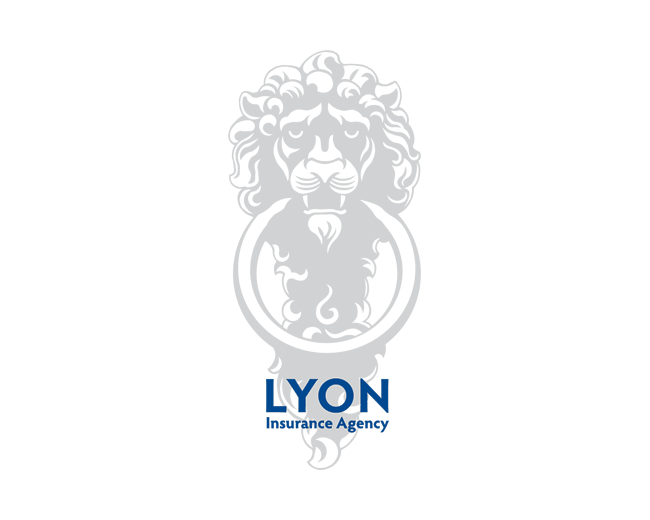
Lyon Insurance Agency
by THEArtistT • Uploaded: May. 11 '11

Float
(Floaters:
29 )
Description:
Client wanted a bold logo that played off of his name. Here the door knocker is the 'O' in LYON.
Status:
Client work
Viewed:
7,056
Tags:
home
•
antique
•
knocker
•
door
Share:

Lets Discuss
Could you get rid of that background?
ReplyYes. Yes I can.
ReplyMuch better. I think your LYN typeface needs to be lighter (and smaller) to work with the O better.
ReplyI agree but the client wanted a bold font. I offered this and a version that matched the knocker ring. I didn't go as heavy as he wanted (he's a muscle bound guy). Would probably be easier to make the knocker thicker and I did try that, but decided against it in the end.
ReplyThanks Sam. Really appreciate it.
ReplyLooks great Trish. I completely understand why you chose to place the Lion/knocker where it is so that the 'O' part works optically kerning wise but I think the uneven space created between the lions head on each side is a little distracting. Have you tried kerning it evenly using the whole lion/knocker image as the form rather than the ring that creates the O? Of course if you did that you would then have to play around with the tracking of 'Insurance' %26 'Agency' to make it fit again.**Just thinking out loud, I likes it :)
ReplyI would love to see LYON as a classy and subtle serif typeface. Then %22Insurance Agency%22 a clean sans-serif, all caps.
ReplyMaybe just a bit more stroke around the ring? Great illustration either way!
Reply%5EExactly what Gareth said. I felt the exact same thoughts.
ReplyI have to say I liked that the lion's mane itself was not perfectly kerned. I liked that 'flaw' as though the mane and the lion are a bit independent of the lettering. But I may go with your suggestion a little later on. Right now this is approved and I'm on to the next thing. But I'll keep it in mind. I may not be able to use a classy serif with a nice san serif beneath as Sam would like to see (and would be optimum of course), but other subtle tweaks to improve it I can do without the client being the wiser.**I did have a version with a heavier outline on the ring at one point, but comparing it with with the original, I could not say it improved the design. It didn't make it worse, but it didn't improve it either, so I left it off. The client would probably prefer the ring to be heavier%3B although, I have not heard one way or the other.**Thank you guys for the words and the floats!
ReplyThanks for the float Leiliu!
ReplyThank you for the float Yuri!
ReplyAgain, thanks for the float Nash.
Replythat's hot dude! :)
ReplyThank you and thanks for the float!
ReplyThis is solid awsomeness.
ReplyThanks Joel. :)
ReplyThanks for all the recent floats!
ReplyPlease login/signup to make a comment, registration is easy