epu no. 1
by Synthpaper • Uploaded: Sep. 17 '11

Float
(Floaters:
0 )
Description:
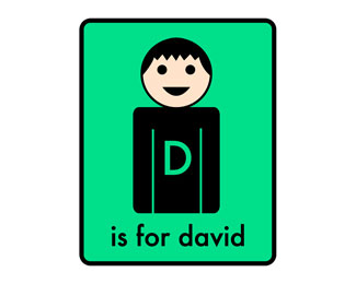
first project logo for epu (environmental psychology unit)
Status:
Student work
Viewed:
2339
Share:


Lets Discuss
Good organization Dav. I like how you have the leaf at the side of epu! Really cool! Good work.
ReplyI saw this before and still like what you did, I like how the EPU name is bounded by a box and your leaf is very simple like a logo should be. It is just a simple clean logo. I think it is good the way it is, however, looking at it, the font may be too heavy for the leaf. Could be a bit lighter?
ReplyI like it. Its simple and creative
ReplyThe way this logo is laid out, to me, it seems like you're trying to make the leaf have a meaning, other than just being a leaf. Meaning you wanted it to be a letter and its clearly not. Speaking of the leaf, they are WAY over used in logos in todays world. I would get away from using it just so it different. *Your colors are good, and I like the lowercase font for the acronym. I would drop the leaf, drop %22environmental physiology unit%22 and put the box around it, around the epu. This is just my opinion, I'd have to see it though.
Replylithean - you almost just described one of my first versions of this logo, then I started thinking %22hey, I should make it more friendly and %22environmental lookin'%22 ... heh.
ReplyPlease login/signup to make a comment, registration is easy