Description:
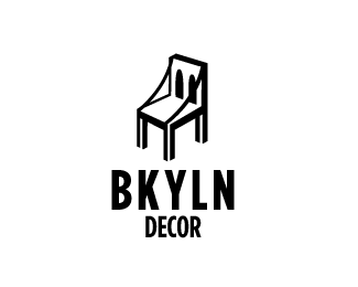
A bridge and a chair combined to make a powerful solution to a Brooklyn furniture store.
As seen on:
N/A
Status:
Just for fun
Viewed:
6088
Tags:
combination
•
purple
•
New York
•
furniture
Share:



Lets Discuss
Nice idea. You need to take care of line work - thick/thin balance is not good/unfinished... legs white lines need to be thicker, behind leg is obsolete-breaking the flow, etc...
Replythanks for the feedback ,so how would you suggest i do that? Going into illustrator and making the chair legs lines thicker and getting rid of the behind leg.
Replyyes, three white lines thicker and straight, loose the back leg, or at least the whit line in it...
Replyfixed it ,makes a big difference. Looks finished now.
ReplyNow go play with typography, make your own typeface, ha!
Replylove it my friend!
Replyinterested!
ReplyGood name, great logo!
ReplyThanks guys this logo is going to be featured in logo lounge 10 book , so excited
ReplyPlease login/signup to make a comment, registration is easy