")
Float
(Floaters:
0 )
Description:
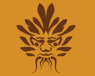
Some of you might notice the similarities between this and the rotten noble logo. Not an intentional rip off wanted to make something in the same style and became a little over influenced along the way. My first go at a crest logo and gave the client several versions so I'm not hard on myself about it. If it offends anyone I'll remove it from the site.
Status:
Nothing set
Viewed:
553
Share:

Lets Discuss
i just want to say it's perfectly fine to be inspired by something and want to make something in the same style. but there are millions of patterns you can pick for a crest, why chose the same %22blood splatter/ plain white space /dripping horizontal lines and leaves%22 pattern, and have the blood spot at the same top left corner of the name? I just think you are capable to create something in the same style , has similar feel but looks different.
ReplyI meant %22dripping *diagonal lines%22
ReplyYeah I agree. All I can say is this was one of my first jobs and if I was to do it again today I would go about it differently. I mean it’s not like I had a picture of the logo at my side the whole time it was more of I want to do something a bit like that then when I checked back it looked a lot like that. The biggest lesson is I should have gone out of my way to MAKE SURE that it looked more unique.
ReplyPlease login/signup to make a comment, registration is easy