Hunter
by StephenJames • Uploaded: Nov. 04 '09 - Gallerized: Nov. '09

Float
(Floaters:
46 )
Description:
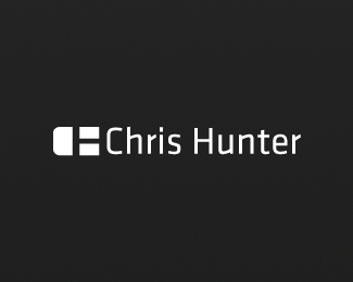
Logo done for a friend of mine. He is a web designer, I've created a mouse using his initials. wip, feedback appreciated. Criticism welcome!
Status:
Unused proposal
Viewed:
9151
Share:


Lets Discuss
Lucky friend. Ditch the outline or reduce some. Big kudos.
ReplyThank you logomotive, means alot %3D) *My thought with the outline was a mousepad.. Think it should be reduced?
ReplyWelcome, at least reduce the outline to the same as the type. nice choice of type BTW.
ReplyUpdate, Thanks again. *Much better.
ReplyI agree ditch the outline, it distracts from the very cool mark/mouse and IMO you really don't need it to identify the mouse. *
ReplyCall me crazy, but I like the outline.
ReplyThis logo changed my life
ReplyI'll have to upload one without the outline so you guys can see it. *pjm - I'm glad to have made an impact in your life Lol.*
ReplyOK after seeing both now and with reduced outline I'm crazy with Jared. This one.
ReplyI like it I guess. The different weight in the H is throwing me off. Maybe I'm not seeing it correctly.
ReplyC on outside, H on the inside, I think. I definitely agree with Joe though, you may want to increase the weight of the H so it matches the C. It's easily done.
ReplyThank you much for the criticism. I'll try that out I can definitely see where your coming from with the weight issue now that you mention it.*update soon.*
ReplyYou know what you could do is make the outline on the right side flat and keep the left side rounded. I think that'd really make the CH pop atcha.
Reply%5E Another good idea.
ReplyNow that.... IS HOT.
ReplyUpdated*Thoughts?*Not sure if this takes away from it or not.
Replyheh, very good idea lundeja thank you so much %3D)
Replycool. looks like a mouse and now a smiling face with the right side flat. i like it.
ReplyThank you frank ! I appreciate it.
ReplyOh btw, chad.. the outside wasn't meant to be the C but I guess that does work.. If you block out the negative space and look at the mark as a whole (without the outline) it is a C
ReplyDefinitley better with the above changes made, good work. The mixture of the thin type %26 the bulkiness of the mouse is a good contrast, as was the decision to keep it B%26W. :)
ReplyThank you very much hayes! I do agree, the changes did help this logo out greatly.*Thanks everyone.
ReplyHot!
ReplyThank you!
Replynice work! (i also see a :D face in there!)
ReplyHis middle name wouldn't be 'Ed' by any chance?
ReplyNo, it is not ed.. Sorry %3D)
ReplyA vast improvement over the earlier version.
ReplyThank you very much firebrand, I agree.
Replynice!
Reply(R)
Replyclever, simple ellegance, congrat.
ReplyVery nice solution.
ReplyThis is pretty solid. Nice job.
ReplyThanks !mude rincon,imude,ahab.. highly appreciated!
ReplyVery nice. I love logos with negative space that DOESN'T pop out like this - more sophisticated because you have to make your mind work a bit to see it. Love to see this refining process on here as well. Great work everyone!
ReplyGreat job. I feel like some people might not get that it's a mouse- but once you see it, once kind of has a feeling of accomplishment as if they just solved a little puzzle or something. If that makes any sense.
ReplyPlease login/signup to make a comment, registration is easy