Description:
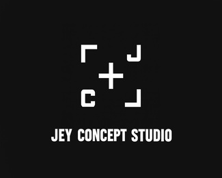
The logo for Jey Concept Studio is a modern and symbolic representation of the brand’s core values — precision, creativity, and professional vision . Inspired by the focusing mechanism of a camera, the design reflects the essence of cinematic storytelling and visual artistry that lies at the heart of our studio.
At its center is a minimalist plus sign (+) , reminiscent of the autofocus point in a camera — a symbol of clarity, focus, and precision. This central element represents the studio's commitment to delivering sharp, high-quality content and capturing moments with purpose and intention.
Surrounding the plus are geometric square frames , which evoke the structure of a film frame or camera composition grid. These elements suggest order, professionalism, and a structured creative process, while also framing the focal point — the core idea behind every project we produce.
Inside two of the squares, you’ll find stylized letters "J" and "C" , representing Jey Concept , subtly integrated into the design. This adds a unique and personalized touch to the logo, reinforcing brand identity while maintaining a clean and contemporary aesthetic.
The black-and-white color scheme enhances the minimalism of the design, giving it a timeless and elegant feel. It also pays homage to classic cinema and photography, where monochrome visuals often convey depth, emotion, and artistic expression.
Overall, this logo embodies the spirit of Jey Concept Studio — a fusion of technical precision, creative vision, and cinematic excellence. It is versatile, memorable, and perfectly aligned with the identity of a forward-thinking media production company.
Status:
Client work
Viewed:
104
Share:

Lets Discuss
Please login/signup to make a comment, registration is easy