Description:
The first logo I ever designed. Back in 2006.
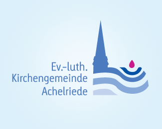
Logo for a local christian/protestant chruch community.
The Logo shows the significance of an individual, single person (visualized by the water drop) inside the whole community (the water). The individual person is literly able to "move", to "change", to "do" something. This is visualized by the waves of the water.
Overall it means: If the individual person, maybe totally new to the church, wants to bring himself and his ideas into the christian community, he can reach something because even a single person is worth a lot and has much to offer.
The overall simple shape of the chruch building points out that the logo is for a christian community. The violet color of the drop referes to the color the protestant church uses in germany and stands for the faith of the individual person.
Additionally the blue of the water in its different steps supports the moveing wave character and adds some motion.
Since I had to compete against 24 other students in my class, this became one of 22 other "unused proposals" ;)
Status:
Student work
Viewed:
1949
Share:


Lets Discuss
Please login/signup to make a comment, registration is easy