Float
(Floaters:
74 )
Description:
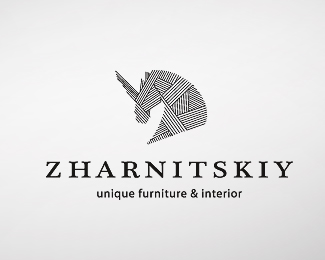
Logo for interior design studio / draft.
Status:
Nothing set
Viewed:
10865
Share:

Lets Discuss
Interesting pattern technique. The horn may be a tad thick. Also, I would try a different typeface for the bottom text. Fun mark though!
Reply%3D)
Replyvery modern concept here. the only thing i would do is make the text smaller. other than that, great work as usual, kirill!
Replyvery intersting style, original
ReplyTo janzabransky: But it was rejected unfortunately%3D)
ReplyGreat style, sorry it wasn't picked up... :)
ReplyAlways been a fan of this bad boy!
ReplyDesign matches the unique tagline, good work
Replythe best work is often rejected, sad in this case as you have a commendable design here
ReplyNice! I like the linework and the overall shape.
Reply:) Actually, the client doesn%60t like the Unicorns%3D(
Replywow. one of the most original executions on this site.
Replyvery cool style
ReplyIntereseting graphic!*
Replyreally original mark*to me it says sophisticated and well thought out
ReplyI really contemporary idea here. I would just cut the book in half. other from that, kirill, excellent job as always!
Replyhttps://phrazle.co
Please login/signup to make a comment, registration is easy