Description:
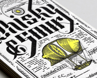
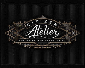
Logo design for a high end fashion retailer of vintage goods.
Status:
Client work
Viewed:
1988
Tags:
•
custom type
•
lines
•
balloon
Share:
Lets Discuss
'Sour' is very hard to read when it's at smaller sizes, looks like 'Smir'. Is that the reasoning for the more stripped down logo in the variables?
ReplyPlease login/signup to make a comment, registration is easy